Dropout model of dating apps
In this post I continue my exploration of the [1]. In this post I will consider what happens if the users decide to dropout from the app as soon as they are matched with somebody.
Dropout model
The dropout model follows the premise of the dynamic model. The only difference is that the users now will stop using the app as soon as they are matched with somebody. To make the properties of the model interesting let us introduce threshold \( T \), which is the number of likes to be given to each other until the users are matched.
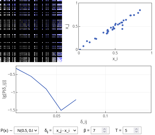
As can be seen below nothing out of ordinary is happening. Users most often form relationships with other users of similar attractiveness (\( x_i \) vs \( x_j \) dots fall on a straight line, absolute \( \delta_{ij} \) value distribution is rather narrow).
 Fig. 1:Simulation results of the dropout model: some of the relevant properties of the relationship formed by the users shown.
When exploring the interactive app below you should be able to see that decreasing \( T \) creates more unequal matches. E.g., with \( T = 1 \) one often observes \( \delta_{ij} \) as big as \( 0.3 \), while for \( T = 20 \) one sees \( 0.03 \) at best.
This is kind of obvious conclusion as through multiple interactions users are able to better discover whether their partner is actually a good match. While the less attractive partner might want to continue relationship, the more attractive partner will quite likely terminate a very unequal relationship.
Similarly large \( T \) can require to wait longer for the matches to be made.
Why the interactive app appears to "freeze"? When most the users are matched and removed it might hard or impossible for other users (usually no more than \( 2 \) or \( 4 \)) to find their match. I believe this is not an inherent property of the model, but instead finite-size effect. If the number of agents would be extremely large, the fraction of unmatched agents would quickly go to zero.
Interactive app
In the interactive app below you can see four plots. The top left plot is the "relationship" (or "popularity") matrix between the individual users. Its each row corresponds to user giving reaction and each column corresponds to user receiving reaction. In this plot blue color indicates at least one one-sided like given to another user (more intense blue indicates more likes given). Dark gray colors indicate that a user has given more dislikes than likes to the receiving user (darker color indicates more negative balance). The removed users are blacked out. Note that the users in this plot are sorted from the least attractive (top rows) to the most attractive (bottom rows).
The top right plot shows each matched pair as a dot. Coordinates of dot correspond to attractiveness of the two users forming the pair. Note that most matches fall close to \( x_i = x_j \) line.
The bottom plot shows the distribution of absolute difference in attractiveness of matched individuals (absolute \( \delta_{ij} \)). Note that y-axis is base 10 logarithm of the probability. Hence straight line would indicate an exponential distribution. Unlike earlier this is not clearly seen as there are just a few data points (at most \( 50 \) pairs are formed).
References
- F. Olmeda. Towards a statistical physics of dating apps. arXiv:2107.14076 [physics.soc-ph].
